Futura for the win
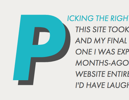
Picking the right typeface for this site took a long time, and my final choice wasn’t one I was expecting. Ask 3-months-ago-me if I'd set a website entirely in Futura and I'd have laughed at you.

Picking the right typeface for this site took a long time, and my final choice wasn’t one I was expecting. Ask 3-months-ago-me if I'd set a website entirely in Futura and I'd have laughed at you.[1]
My initial ‘Contemporary Drop Cap’ concept was much more florid and overtly ornamental than what you see today (as of April 2014). I burnt through many drafts experimenting with ornate serif fonts before I finally remembered that what I was trying to build was a portfolio; a neutral backdrop for my designs, not something that would distract from the work on show. In short, I needed a sans.
Neutral doesn't mean flavourless.
Even the most generic-seeming typefaces have their own distinct flavour, as my Helvetica-fuelled “Hey look! I just discovered Swiss Design” phase will attest (now commonly known as my “God-awful Superdry Period”).
I've developed a deep and abiding love for a perfectly circular “o”, so when choosing a sans I normally start with the geometrics. I'm particularly fond of the classically-British ‘modern’ fonts of Edward Johnston and the saucy Eric Gill, but I've used them far too often already. If I used them in my portfolio site as well, I'd start to look like a one-trick pony.
H&FJ(RIP)'s Gotham looked lovely, but I can’t help but feel it’s on fashion's downward slope now. Far too many people are using it without thinking, and of course it carries a certain politicised air with it now, too (thanks, Obama!). So keeping with the geometric “o” theme, the next obvious choice was Futura.
Retro futurism
I'd like to say there is some elaborate over-arching theoretical underpinning to my choice of Futura, but the reality is more prosaic. Sure I could waffle on about the retro-futurist stylings of the “W”s and “M”s, and how they fit into the dialectics of 20th Century design praxis, but in truth it was simply next on the list of “things to try”.
Once I saw my generously-margined headings set in Futura Bold I was smitten. Couple that with the not-too-shouty elegance of the all-caps italic, and I'd found the lynchpin for my design.
Flawed Futura
Unlike many others, I actually quite like Futura's much-maligned question mark, for all it's eccentric meanderings. There are, though, some very visible problems with the ParaType cut of the font (the one I use via Typekit), and quite possibly with the typeface as a whole, too.
The lowercase “J” looks stylish and bizarre in equal measure, and the semicolon is oddly top-heavy. In body copy the x-height is a tad lower than I find comfortable and the letter spacing after an apostrophe is massive. Not an issue in a programme that lets you kern, but an ugly cross to bear on the web.
In fact, all the apostrophes and quotation marks look the same. It’s all well and good training yourself to press alt shift ] every time you want an apostrophe, but Futura renders such efforts irrelevant. How many different characters can you count in the following sentence?

Tough, eh?! It's a little easier at larger sizes:
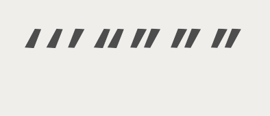
There are actually seven discrete glyphs there. There are differences, which at large sizes are delightfully subtle and nuanced, but at anything less than 72pt they all blur into one...
A designer's website is like a builder's house; always the last to be finished.
This blog-cum-portfolio site of mine has been through a seemingly infinite number of variations. What you see in April 2014 is only the third full ‘theme’ to make it all the way into code and deployment, but if you count Illustrator mockups then the number of iterations trebles. Count paper sketches – even limiting yourself just to fully drawn out and wire-framed designs – and the total skyrockets.
Only time will tell how long this current designs sticks around for, but it already feels like this version is a more substantial website than any of my previous attempts. Picking Futura and sticking with it, despite the issues and imperfections, has meant I've been able to turn my attention to the finer details: the little moments of interaction design, the negative space, and above all the content.
This post was written in 2014. As you've no doubt already noticed, I've moved on from Futura as the typeface for this site. ↩︎
Related posts
If you enjoyed this article, RoboTom 2000™️ (an LLM-powered bot) thinks you might be interested in these related posts:
I changed my site's font to Comic Sans as an April Fool. It was a disaster.
I often hear that "good design" works in all situations, no matter what typeface you wrap it in. The reality is a little more nuanced.
Similarity score: 88% match. RoboTom says:
Simple is hard
How I learnt to focus on substance over style, and began to rethink my relationship with ‘good design’.
Similarity score: 82% match. RoboTom says: